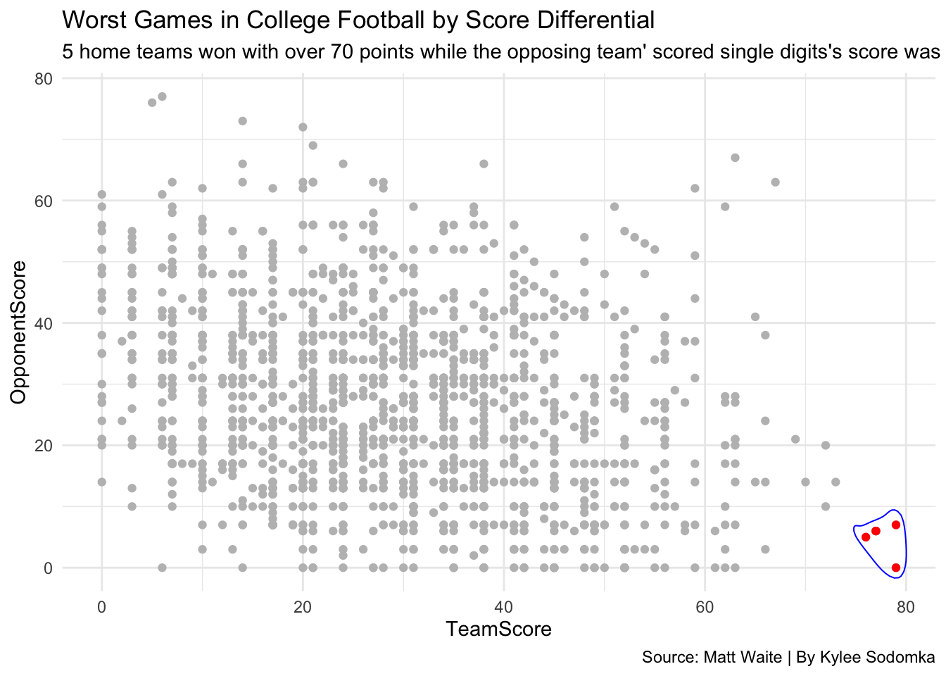
I am going to be cleaning up some text in a football file and create a scatterplot of it.The first step I need to do is include all the libraries I will be using.
library(tidyverse)## ── Attaching packages ─────────────────────────────────────── tidyverse 1.3.1 ──## ✓ ggplot2 3.3.5 ✓ purrr 0.3.4
## ✓ tibble 3.1.3 ✓ dplyr 1.0.7
## ✓ tidyr 1.1.3 ✓ stringr 1.4.0
## ✓ readr 2.0.1 ✓ forcats 0.5.1## ── Conflicts ────────────────────────────────────────── tidyverse_conflicts() ──
## x dplyr::filter() masks stats::filter()
## x dplyr::lag() masks stats::lag()library(dplyr)
library(ggalt)## Registered S3 methods overwritten by 'ggalt':
## method from
## grid.draw.absoluteGrob ggplot2
## grobHeight.absoluteGrob ggplot2
## grobWidth.absoluteGrob ggplot2
## grobX.absoluteGrob ggplot2
## grobY.absoluteGrob ggplot2Here is the data I will be using for this project.
badtext <- read_csv("badfootballlogs19.csv")## Rows: 1662 Columns: 51## ── Column specification ────────────────────────────────────────────────────────
## Delimiter: ","
## chr (8): Date, HomeAway, Opponent, Result, TeamFull, TeamURL, Team, Conference
## dbl (43): Game, PassingCmp, PassingAtt, PassingPct, PassingYds, PassingTD, R...##
## ℹ Use `spec()` to retrieve the full column specification for this data.
## ℹ Specify the column types or set `show_col_types = FALSE` to quiet this message.Now, for the fun part. My first step is going to be using the Result column and splitting it into an “Outcome” and “Score” column.
badtext %>% separate(Result, into=c("Outcome", "Score"), sep="\\ ") ## # A tibble: 1,662 × 52
## Game Date HomeAway Opponent Outcome Score PassingCmp PassingAtt PassingPct
## <dbl> <chr> <chr> <chr> <chr> <chr> <dbl> <dbl> <dbl>
## 1 1 8/24/19 N Miami (… W (24-… 17 27 63
## 2 2 9/7/19 <NA> Tenness… W (45-… 30 36 83.3
## 3 3 9/14/19 @ Kentucky W (29-… 21 30 70
## 4 4 9/21/19 <NA> Tenness… W (34-… 24 34 70.6
## 5 5 9/28/19 <NA> Towson W (38-… 24 28 85.7
## 6 6 10/5/19 <NA> Auburn W (24-… 25 39 64.1
## 7 7 10/12/19 @ Louisia… L (28-… 24 44 54.5
## 8 8 10/19/19 @ South C… W (38-… 21 33 63.6
## 9 9 11/2/19 N Georgia L (17-… 21 33 63.6
## 10 10 11/9/19 <NA> Vanderb… W (56-… 27 40 67.5
## # … with 1,652 more rows, and 43 more variables: PassingYds <dbl>,
## # PassingTD <dbl>, RushingAtt <dbl>, RushingYds <dbl>, RushingAvg <dbl>,
## # RushingTD <dbl>, OffensivePlays <dbl>, OffensiveYards <dbl>,
## # OffenseAvg <dbl>, FirstDownPass <dbl>, FirstDownRush <dbl>,
## # FirstDownPen <dbl>, FirstDownTotal <dbl>, Penalties <dbl>,
## # PenaltyYds <dbl>, Fumbles <dbl>, Interceptions <dbl>, TotalTurnovers <dbl>,
## # TeamFull <chr>, TeamURL <chr>, DefPassingCmp <dbl>, DefPassingAtt <dbl>, …My next step will be using the gsub function to get rid of the parentheses in the score. I will mutate the Score column twice to get ride of ( and then ).
badtext %>% separate(Result, into=c("Outcome", "Score"), sep="\\ ") %>%
     mutate(Score = gsub("\\(", "", Score)) %>%
   mutate(Score = gsub(")", "", Score))
## # A tibble: 1,662 × 52
## Game Date HomeAway Opponent Outcome Score PassingCmp PassingAtt PassingPct
## <dbl> <chr> <chr> <chr> <chr> <chr> <dbl> <dbl> <dbl>
## 1 1 8/24/19 N Miami (… W 24-20 17 27 63
## 2 2 9/7/19 <NA> Tenness… W 45-0 30 36 83.3
## 3 3 9/14/19 @ Kentucky W 29-21 21 30 70
## 4 4 9/21/19 <NA> Tenness… W 34-3 24 34 70.6
## 5 5 9/28/19 <NA> Towson W 38-0 24 28 85.7
## 6 6 10/5/19 <NA> Auburn W 24-13 25 39 64.1
## 7 7 10/12/19 @ Louisia… L 28-42 24 44 54.5
## 8 8 10/19/19 @ South C… W 38-27 21 33 63.6
## 9 9 11/2/19 N Georgia L 17-24 21 33 63.6
## 10 10 11/9/19 <NA> Vanderb… W 56-0 27 40 67.5
## # … with 1,652 more rows, and 43 more variables: PassingYds <dbl>,
## # PassingTD <dbl>, RushingAtt <dbl>, RushingYds <dbl>, RushingAvg <dbl>,
## # RushingTD <dbl>, OffensivePlays <dbl>, OffensiveYards <dbl>,
## # OffenseAvg <dbl>, FirstDownPass <dbl>, FirstDownRush <dbl>,
## # FirstDownPen <dbl>, FirstDownTotal <dbl>, Penalties <dbl>,
## # PenaltyYds <dbl>, Fumbles <dbl>, Interceptions <dbl>, TotalTurnovers <dbl>,
## # TeamFull <chr>, TeamURL <chr>, DefPassingCmp <dbl>, DefPassingAtt <dbl>, …I am going to separate the Score column now to “TeamScore” and “OpponentScore”. I will also get rid of the dash by using \ and then the dash right after it. I am going to create a new dataframe called “bettertext” to save what I have done.
badtext %>% separate(Result, into=c("Outcome", "Score"), sep="\\ ") %>%
     mutate(Score = gsub("\\(", "", Score)) %>%
   mutate(Score = gsub(")", "", Score)) %>%
  separate(Score, into=c("TeamScore", "OpponentScore"), sep="\\-") %>%
    mutate(TeamScore = as.numeric(TeamScore), OpponentScore = as.numeric(OpponentScore)) -> bettertext
I made the text better and made it into a new dataframe. Now, I can move onto the next step: putting it in a scatterplot. I am going to create a new field called “differential” where I will take TeamScore - OpponentScore. Then, I will filter the differential so that it is greater than 65 points. After that, I will take this code and make it into a new dataframe called “worstgames”.
bettertext %>%
  mutate(
    differential = TeamScore - OpponentScore) %>%
filter (differential > 65) -> worstgames
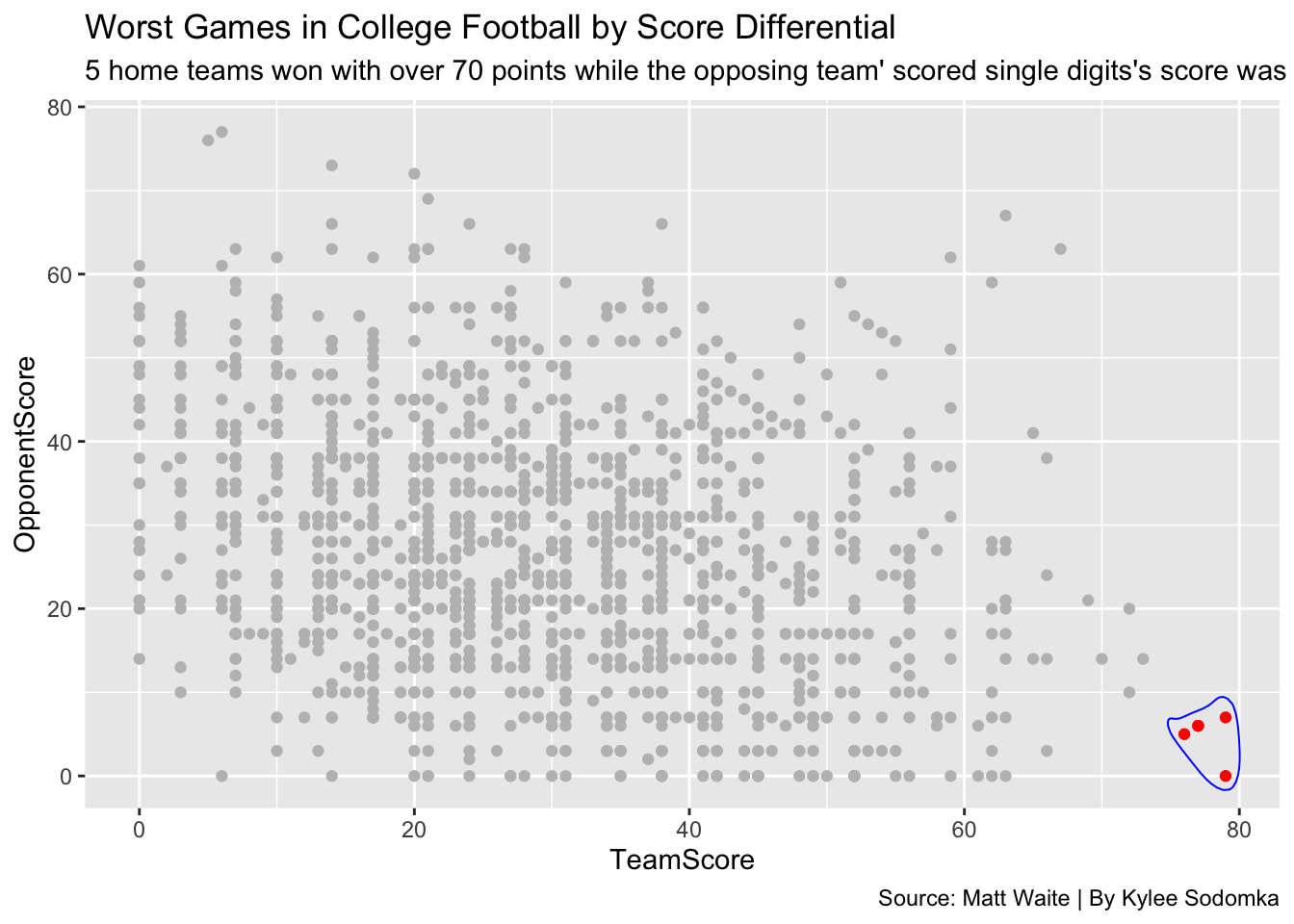
I am going to create a scatterplot with the bettertext data. I will put the TeamScore on the x axis and the OpponentScore on the y axis. I will make the color of these games gray to make it easier to see the worst games when I add color to them next.
ggplot() +
  geom_point(data=bettertext, aes(x=TeamScore, y=OpponentScore), color="gray")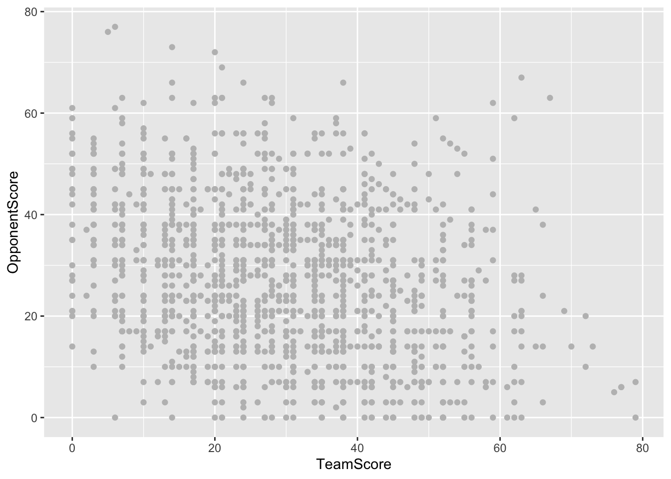
I am going to copy the previous code and add onto it. Everything will be the same, but I’ll be using the data from worstgames and make them red to be able to see easier.
ggplot() +
  geom_point(data=bettertext, aes(x=TeamScore, y=OpponentScore), color="gray") +
  geom_point(data=worstgames, aes(x=TeamScore, y=OpponentScore), color="red")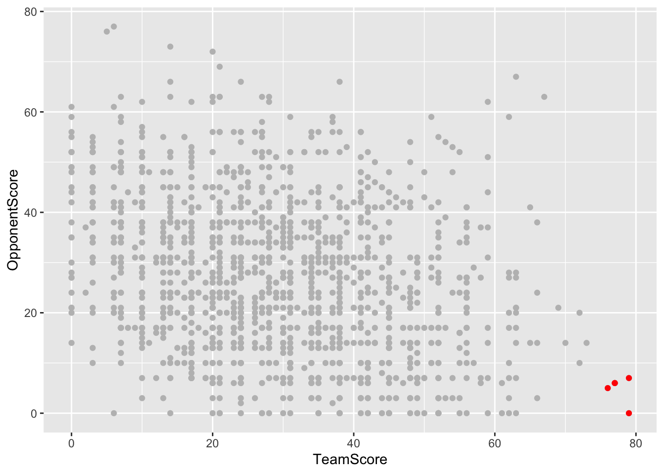
If that wasn’t easy enough to find, I am also going to circle the worst games with a blue line. I will use the geom_encircle function (why I installed ggalt earlier) and put all of the same information that I used when I added worstgames onto the scatterplot. I am making the s_shape 0 then expand to 0.02 to make it that far away from the dots.
ggplot() +
  geom_point(data=bettertext, aes(x=TeamScore, y=OpponentScore), color="gray") +
  geom_point(data=worstgames, aes(x=TeamScore, y=OpponentScore), color="red") +
    geom_encircle(data=worstgames, aes(x=TeamScore, y=OpponentScore), s_shape=0, expand=0.02, colour="blue")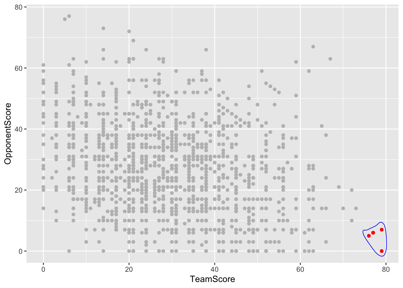
It’s time to label this graph. I will add a title, subtitle and caption to give the reader more information about what they are seeing on the scatterplot.
ggplot() +
  geom_point(data=bettertext, aes(x=TeamScore, y=OpponentScore), color="gray") +
  geom_point(data=worstgames, aes(x=TeamScore, y=OpponentScore), color="red") +
    geom_encircle(data=worstgames, aes(x=TeamScore, y=OpponentScore), s_shape=0, expand=0.02, colour="blue") +
  labs(
    title="Worst Games in College Football by Score Differential", subtitle="5 home teams won with over 70 points while the opposing team' scored single digits's score was only single digits.",
    caption="Source: Matt Waite | By Kylee Sodomka"
  )
I’m going to add theme_minimal() just to make the graph look nicer and more organized.
ggplot() +
  geom_point(data=bettertext, aes(x=TeamScore, y=OpponentScore), color="gray") +
  geom_point(data=worstgames, aes(x=TeamScore, y=OpponentScore), color="red") +
    geom_encircle(data=worstgames, aes(x=TeamScore, y=OpponentScore), s_shape=0, expand=0.02, colour="blue") +
  labs(
    title="Worst Games in College Football by Score Differential", subtitle="5 home teams won with over 70 points while the opposing team' scored single digits's score was only single digits.",
    caption="Source: Matt Waite | By Kylee Sodomka"
  ) + theme_minimal()