Taylor Edwards and Tristen Edwards. Two sisters who have both played softball at Nebraska and left their names in the record books. Both have proven their power with their bats. But which sister was the more effective hitter?
Let’s take a look and see how they did compare career-wise with hits and runs batted in (RBIs).
library(tidyverse)
library(dplyr)
library(cowplot)
library(ggrepel)
library(waffle)
library(gt)

softball <- read_csv("~/Desktop/SPMC 350/Stats for project!.csv")
huskerplayers <- read_csv("~/Desktop/SPMC 350/huskersoftball.csv")
The data I will be working with is hitting statistics for only Taylor and Tristen from the Husker softball statistics page. For this graphic, I am using information from the Overall Hits per season and the total RBIs.
First, I need to create two data sets that each has a new column. One will have the sum of Overall Hits and the other will have the sum of RBIs.
softball %>%
  group_by(Player) %>%
  summarize(
    Hits = sum(`Overall Hits`)
  ) -> overallhits
softball %>%
group_by(Player) %>%
summarize(
RBIs = sum(`Overall RBIs`)
) -> rbisBetween the two sisters, Taylor had more hits and RBIs. I’m going to create a code for just her. I will highlight her stats in the graphic later. The next block I run should show just the older sister’s totals.
softball %>%
  filter(Player == "Taylor") %>%
  group_by(Player) %>%
  select(Season, `Overall RBIs`, `Overall Hits`) %>%
  summarize(
    taylorrbis = sum(`Overall RBIs`),
    taylorhits =sum(`Overall Hits`)
  ) -> tay
## Adding missing grouping variables: `Player`Now that this information is ready, it’s time to create some bar graphs. I will make two of them: one for hits and one for RBIs. They will become two new sets called bghits and bgrbis.
ggplot() +
  geom_bar(data=overallhits, aes(x=Player, weight=Hits)) +
  geom_bar(data=tay, aes(x=Player, weight=taylorhits), fill="#E41C38") +
  labs(
    title="Looking at the basics...",
    subtitle="Just looking at career hits and runs batted in...",
    caption=" ",
    x="Player",
    y="Number of Hits"
  ) +
  theme_minimal() +
  theme(
    plot.title = element_text(size = 16, face = "bold"),
    axis.title = element_text(size = 8),
    axis.text = element_text(size = 7),
    axis.ticks = element_blank(),
    panel.grid.minor = element_blank(),
    panel.grid.major.x = element_blank()
  ) +
  coord_flip() +
      geom_text(aes(x=2.5, y=189), label="213 Hits") +
    geom_text(aes(x=1.5, y=196), label="220 Hits") -> bghits
ggplot() +
geom_bar(data=rbis, aes(x=Player, weight=RBIs)) +
geom_bar(data=tay, aes(x=Player, weight=taylorrbis), fill="#E41C38") +
labs(
title="...Taylor was the better hitter",
subtitle="...the older sister dominated both.",
caption="Source: Huskers.com | Graphic by Kylee Sodomka",
x=" ",
y="Total RBIs"
) +
theme_minimal() +
theme(
plot.title = element_text(size = 16, face = "bold"),
axis.title = element_text(size =8),
axis.text = element_text(size = 7),
axis.ticks = element_blank(),
panel.grid.minor = element_blank(),
panel.grid.major.x = element_blank()
) +
coord_flip() +
geom_text(aes(x=2.5, y=133), label="157 RBIs") +
geom_text(aes(x=1.5, y=178), label="202 RBIs") -> bgrbisThese two dataframes will be used to create a cowplot. The first question we’ll see the answer to is which sister had more career hits and RBIs?
plot_grid(bghits, bgrbis)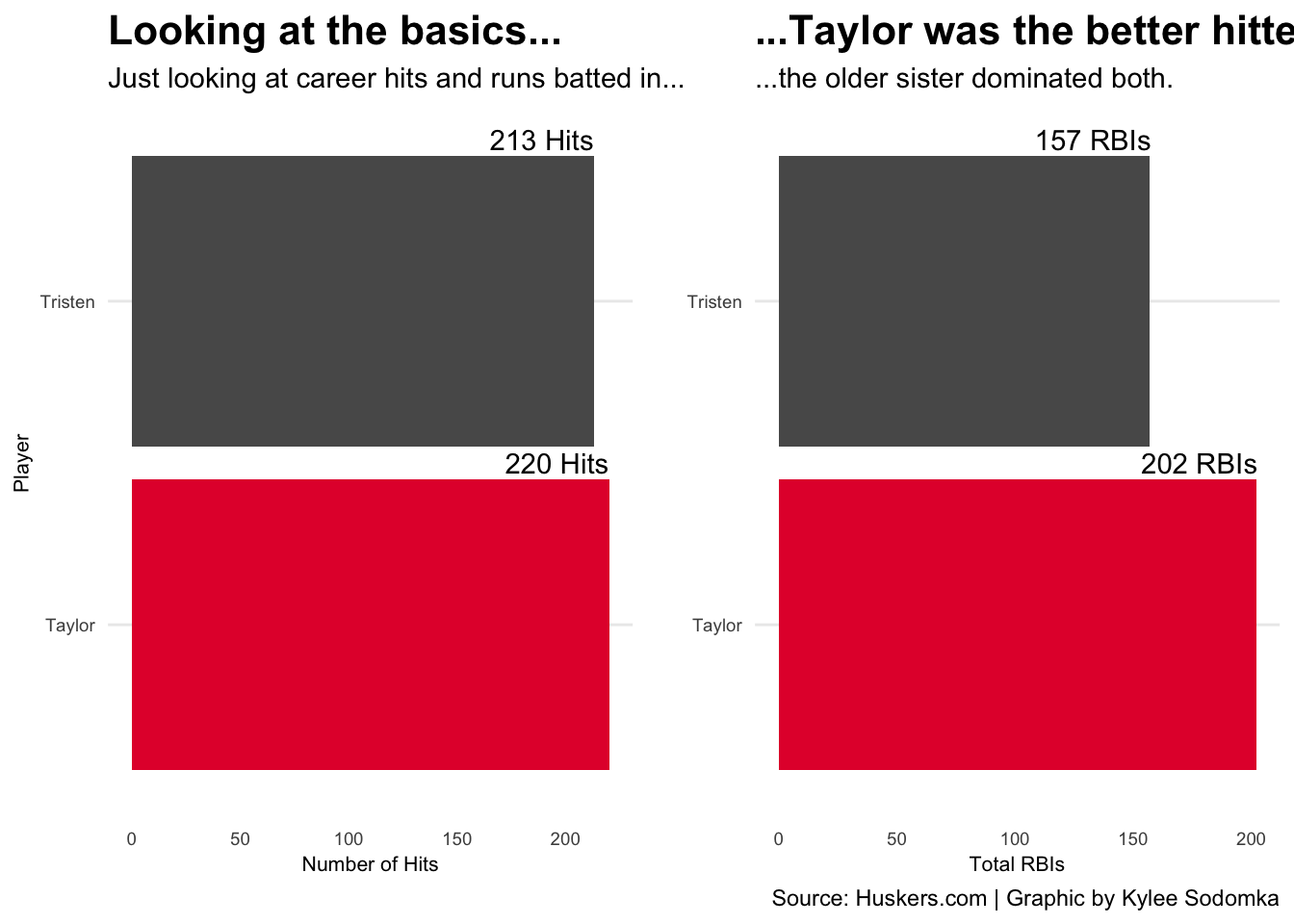
If I only looked at who led these categories, Taylor would have it in the bag. However, I want to find who was more EFFECTIVE. To win softball games, you need runs. An effective batter will find a way to get these runs. Let’s see which sister was more productive.
To compare their productivity, I’m going to use a stacked bar chart. We know their total RBIs, but how did they get them? I’ll create a dataframe that only contains the total number of RBIs based on a specific hit. This new set will be called typeofrbis.
softball %>%
  group_by(Player) %>%
  select(Season, `RBIs off HRs`, `RBIs off 3Bs`,
         `RBIs off 2Bs`, `RBIs off 1Bs`, `RBIs elsewhere`) %>%
  summarize(
    homeruns = sum(`RBIs off HRs`),
    triples = sum(`RBIs off 3Bs`),
    doubles = sum(`RBIs off 2Bs`),
    singles = sum(`RBIs off 1Bs`),
    other = sum(`RBIs elsewhere`)) -> typeofrbis
## Adding missing grouping variables: `Player`I need to make this data longer to make a stacked bar chart. The new dataset that has long data will be called rbilong.
typeofrbis %>%
  pivot_longer(cols=c(homeruns, triples, doubles, singles, other),
               names_to="Type", values_to="Number") -> rbilong
The second question we’ll ask and answer is who’s hits were more productive? Here’s the number of RBIs per kind of hit.
ggplot() +
  geom_bar(data=rbilong, aes(x=Player, weight=Number, fill=Type)) +
  labs(
    title="Once again, Taylor beat Tristen with hits that led to RBIs",
    subtitle="The younger sister's hits produced a lot of runs for her team, but the older Edwards had more.",
    caption="Source: Huskers.com | Graphic by Kylee Sodomka",
    x="Player",
    y="Total"
  ) +
  theme_minimal() +
  theme(
    plot.title = element_text(size = 16, face = "bold"),
    axis.title = element_text(size = 8),
    axis.text = element_text(size = 7),
    axis.ticks = element_blank(),
    panel.grid.minor = element_blank(),
    panel.grid.major.x = element_blank()
  ) +
  coord_flip()
Once again, the older sister is proving to be more productive than the younger Edwards. It’s easy to compare between only two players, though. What if we compared Tristen and Taylor to their teammates’ productivity?
I’ll make a scatterplot to compare the sisters to the other Husker players on how many at-bats led to RBIs in a season. I will use the “huskerplayers” set of data that contains all the softball players who played with the sisters during their careers.
I need to make a new column that combines the player’s name and season. I will call this PlayerSeason. This new data will be saved to a set called newhuskerplayers.
huskerplayers %>%
  mutate(
    PlayerSeason = paste(Player, Season, sep=" ")
  ) -> newhuskerplayers
I will use this new dataframe and filter it down to players who have more than 50 at-bats. Many players were listed that had zero at-bats. The data would be off with how many players have not had a consistent number of plate appearances, so they should not be included. This block of code will be saved as abrbi.
newhuskerplayers %>%
  filter(AB > 50) %>%
  group_by(PlayerSeason) %>%
  summarize(
    AtBats = sum(AB),
    RBIs = sum(RBI)
  ) %>%
  na.omit() -> abrbi
Before I make the scatterplot, I have to create a new set of data. We won’t be able to see Taylor’s and Tristen’s points without a new dataset. The code will be the same as before, just with a filter that has only the sisters’ data showing. This new set will be called tandt.
newhuskerplayers %>%
  filter(Player == "Taylor Edwards" |
           Player == "Tristen Edwards") %>%
  filter(AB > 50) %>%
  group_by(PlayerSeason) %>%
  summarize(
    AtBats = sum(AB),
    RBIs = sum(RBI)
  ) %>%
  na.omit() -> tandt
It’s time to put these new dataframes into a scatterplot. The x-axis will be the RBIs and the y-axis will be the number of at-bats. Taylor and Tristen will have red points on the graphic and have their names next to them. Now, for the final question: which Edwards was more productive compared to their teammates?
ggplot() +
  geom_point(data=abrbi, aes(x=RBIs, y=AtBats), color="grey") +
  geom_point(data=tandt, aes(x=RBIs, y=AtBats), color="#E41C38") +
  geom_text_repel(data=tandt, aes(x=RBIs, y=AtBats, label=PlayerSeason)) +
  labs(title="Taylor outperfomed her teammates.Tristen? Kind of.",
       subtitle="The older sister's plate appearences produced more points for the Huskers compared to the younger Edwards.",
       caption="Source: Huskers.com | Graphic by Kylee Sodomka")  +
  theme_minimal() +
  theme(
    plot.title = element_text(size = 16, face = "bold"),
    axis.title = element_text(size = 8),
    plot.subtitle = element_text(size=10),
    panel.grid.minor = element_blank()
    )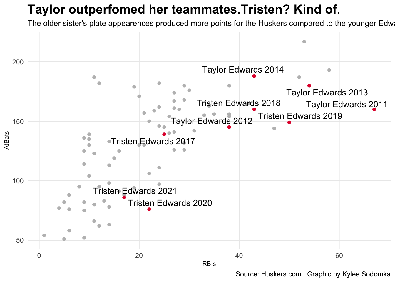
Tristen had less at bats in 2020 and 2021 because of COVID. Not considering these seasons, though, Taylor still had more RBIs with the number of at bats she had.
So, who was the more effective hitter for the Huskers? Taylor Edwards.