The 2021 Trade Deadline was deadly to Chicago Cubs fans. They did not trade one player but the team’s core: Anthony Rizzo, Kris Bryant, and Javier Baez. Without them, I believed that there was no way this team could be as good as they once were. So, I decided to see if the Cubs were truly finished.
One of the things I wanted to look at was the weekly rankings of the Cubs during the season. They were off and on before the trade deadline, but how did they compare to other teams after it?
I first need to load the libraries I will be using and create the dataframes of the data I will need.
library(tidyverse)
library(ggbump)
library(cowplot)
library(ggrepel)
set.seed(1234)
playerdata <- read_csv("~/Desktop/SPMC 350/chicago player stats.csv", col_types=cols())rankings <- read_csv("~/Desktop/SPMC 350/all team rankings.csv", col_types=cols())I will use the rankings data and filter it down to the five teams in the National League Central division. I will also create a dataframe with only the Cubs rankings.
nlcentral <- rankings %>%
  filter(Team == "Chicago Cubs" |
           Team == "Milwaukee Brewers" |
           Team == "Cincinnati Reds" |
           Team == "St. Louis Cardinals" |
           Team == "Pittsburgh Pirates")

cubs <- nlcentral %>%
  filter(Team == "Chicago Cubs")
I will create a bump chart that will show the rankings of the NL Central teams each week in the 2021 season. There will be a vertical line labeled, “After Trade Deadline.” It will show when the Cubs had the core and when they did not.
ggplot() +
  geom_bump(data=nlcentral, aes(x=Week, y=Rankings, color=Team)) +
  geom_point(data=cubs, aes(x=Week, y=Rankings, color=Team), size = 4) +
  scale_color_manual(values = c("#0E3386", "#C6011F", "#0A2351", "#27251F", "#FEDB00")) +
  geom_vline(xintercept = 19) +
  geom_text(aes(x=14.5, y=1, label="After Trade Deadline")) +
  scale_y_reverse() +
  labs(
    title="Cubs started off okay, but didn't finish well",
    subtitle="It was up and down before the trade deadline, then it went dowhill from there.",
    caption="Source: MLB.com | Graphic by Kylee Sodomka",
    x="Week",
    y="Rankings"
  ) +
  theme_minimal() +
  theme(
    plot.title = element_text(size = 16, face = "bold"),
    axis.title = element_text(size =8),
    axis.text = element_text(size = 7),
    axis.ticks = element_blank(),
    panel.grid.minor = element_blank(),
    panel.grid.major.x = element_blank()
  )
Yikes. Now, the Cubs were in a slump when they traded away some of their best players. It would have been a miracle for them to crawl out of that. However, they continued to go down in rankings. It became a battle to not end in last place.
What Rizzo, Bryant and Baez were known for was their batting. They dominated when they were at the plate. Getting rid of three good bats was going to show in the results. Or would they?
I will compare the “OG” core to a group of three players I believe could be the “New” core: Willson Contreras, Patrick Wisdom and Frank Schwindel. I will use the player data and summarize it to just the players, number of at-bats, games and hits.
playerdata %>%
  group_by(Player) %>%
  summarize(
    abs = sum(AB),
    games = sum(G),
    hits = sum(H)
  ) %>% na.omit() -> cubsplayers
I will use the dataframe I created and make two more from it. It will be focused on the original players and the potential new players. I will make Patrick Wisdom his own dataframe for labeling purposes with the graphic.
ogcore <- cubsplayers %>%
  filter(Player == "Anthony Rizzo" |
           Player == "Kris Bryant" |
           Player == "Javier Baez")

newcore <- cubsplayers %>%
  filter(Player == "Willson Contreras" |
           Player == "Frank Schwindel")

patrickwisdom <- cubsplayers %>%
  filter(Player == "Patrick Wisdom")
I will create a scatterplot comparing the Cubs players on how many hits they had in the number of games they played (as a Cub). The OG core will be Cubbie blue, while the New core will be red. We will see how these six players compare and with their other teammates.
ggplot() +
  geom_point(data=cubsplayers, aes(x=games, y=hits), color="grey") +
  geom_point(data=ogcore, aes(x=games, y=hits), color="#0E3386") +
  geom_point(data=newcore, aes(x=games, y=hits), color="#CC3433") +
  geom_point(data=patrickwisdom, aes(x=games, y=hits), color="#CC3433") +
  geom_text_repel(data=ogcore, aes(x=games, y=hits, label=Player)) +
  geom_text_repel(data=newcore, aes(x=games, y=hits, label=Player)) +
  geom_text(aes(x=118, y=78, label="Patrick Wisdom")) +
  labs(
    title="The New core's number of hits are similar to the OG's",
    subtitle="Technically, the original core did better in fewer games, but Schwindel looks promising.",
    caption="Source: baseball-reference.com | Graphic by Kylee Sodomka",
    x="Games Played",
    y="Total Hits"
  ) +
  theme_minimal() +
  theme(
    plot.title = element_text(size = 16, face = "bold"),
    axis.title = element_text(size =8),
    axis.text = element_text(size = 7),
    axis.ticks = element_blank(),
    panel.grid.minor = element_blank(),
    panel.grid.major.x = element_blank()
  )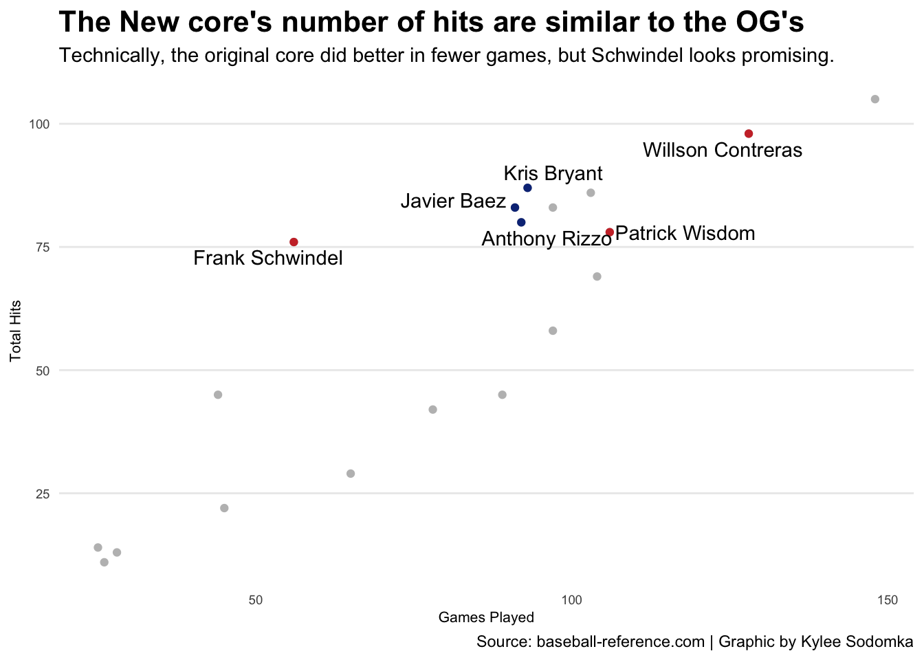
Contreras and Wisdom played in more games. We would hope their numbers would be similar to the OG players. However, Frank Schwindel looks to be very promising. He played in fewer games than anybody but matched Anthony Rizzo’s numbers. That can give Cubs fans some hope.
However, what do you need to win games? Runs. I will compare the cores and the number of RBIs in the 2021 season. It is a similar idea to the scatterplot comparison. But I will be using a cowplot to compare it with OG players and new players. I know Willson Contreras should be considered an OG player since he has been with the Cubs since 2016. But I see him as the new captain of the team. I am comparing him to the new players since he will be looked at as one of the more productive players for the team.
I will use the playerdata again and summarize the total RBIs for players and the “Type of Player” (TOP). I will take this dataframe and create two more for the new and og players. The six featured players will also have their own dataframes for highlighting and labeling purposes.
playerdata %>%
  select(Player, TOP, RBI) %>%
  group_by(Player) %>%
  summarize(
    RBIs = sum(RBI),
    TOP = (TOP)
  ) -> rbis
new <- rbis %>%
filter(TOP == "New")
og <- rbis %>%
filter(TOP == "OG")
AR <- rbis %>%
filter(Player == "Anthony Rizzo")
JB <- rbis %>%
filter(Player == "Javier Baez")
KB <- rbis %>%
filter(Player == "Kris Bryant")
FS <- rbis %>%
filter(Player == "Frank Schwindel")
PW <- rbis %>%
filter(Player == "Patrick Wisdom")
WC <- rbis %>%
filter(Player == "Willson Contreras")Once again, the OG core will be Cubbie blue, and the New core will be red. The og graph will be called the “ogrbibg” and new will be “newrbibg” (bg meaning bar graph).
ggplot() +
  geom_bar(data=og, aes(x=reorder(Player, RBIs), weight=RBIs)) +
  geom_bar(data=JB, aes(x=reorder(Player, RBIs), weight=RBIs), fill="#0E3386") +
  geom_bar(data=KB, aes(x=reorder(Player, RBIs), weight=RBIs), fill="#0E3386") +
  geom_bar(data=AR, aes(x=reorder(Player, RBIs), weight=RBIs), fill="#0E3386") +
labs(
    title="Same story for both cores when it comes to RBIs",
    subtitle="The numbers are not far off between the two groups. Again, look at Schwindel...",
    caption=" ",
    x=" ",
    y=" "
  ) +
  theme_minimal() +
  theme(
    plot.title = element_text(size = 16, face = "bold"),
    axis.title = element_text(size =8),
    axis.text = element_text(size = 7),
    axis.ticks = element_blank(),
    panel.grid.minor = element_blank(),
    panel.grid.major.x = element_blank()
  ) +
  coord_flip() +
  geom_text(aes(x=6, y=68), label="65") +
  geom_text(aes(x=5, y=54), label="51") +
  geom_text(aes(x=4, y=43), label="40") -> ogrbibg
ggplot() +
geom_bar(data=new, aes(x=reorder(Player, -RBIs), weight=RBIs)) +
geom_bar(data=FS, aes(x=reorder(Player, -RBIs), weight=RBIs), fill="#CC3433") +
geom_bar(data=PW, aes(x=reorder(Player, -RBIs), weight=RBIs), fill="#CC3433") +
geom_bar(data=WC, aes(x=reorder(Player, -RBIs), weight=RBIs), fill="#CC3433") +
labs(
title=" ",
subtitle=" ",
caption="Source: baseball-reference.com | Graphic by Kylee Sodomka",
x=" ",
y="Total RBIs"
) +
theme_minimal() +
theme(
plot.title = element_text(size = 16, face = "bold"),
axis.title = element_text(size =8),
axis.text = element_text(size = 7),
axis.ticks = element_blank(),
panel.grid.minor = element_blank(),
panel.grid.major.x = element_blank()
) +
scale_y_reverse() +
coord_flip() +
geom_text(aes(x=1, y=64), label="61") +
geom_text(aes(x=2, y=60), label="57") +
geom_text(aes(x=3, y=43), label="40") -> newrbibgThe two bar graphs will be side-by-side to make it easier to compare where they were RBI-wise compared to the other players.
plot_grid(ogrbibg, newrbibg)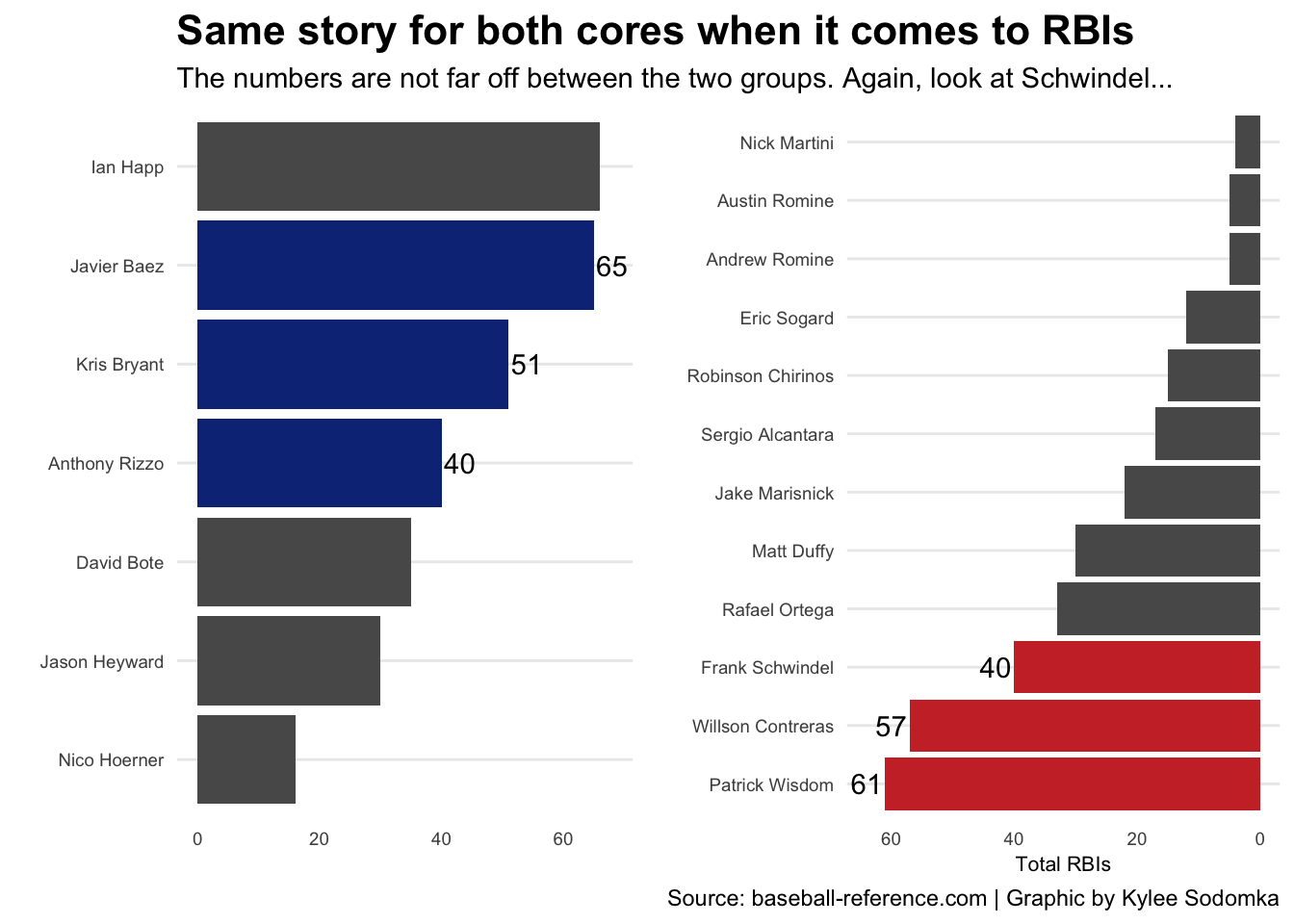
Again, the numbers are very similar between the two groups. You would hope that Contreras and Wisdom would have more RBIs since they were in more games than the OG core, but they had more than the other players. Frank Schwindel is a standout again, having as many RBIs as Rizzo (who played 40 more games than Schwindel). That is very promising.
Am I still heartbroken about my favorite players gone? Absolutely. However, I believe the New core will surprise us and help lead this team to good things. It will only happen as long as Ricketts starts extending some players and stops signing minor league ones.